TL;DR
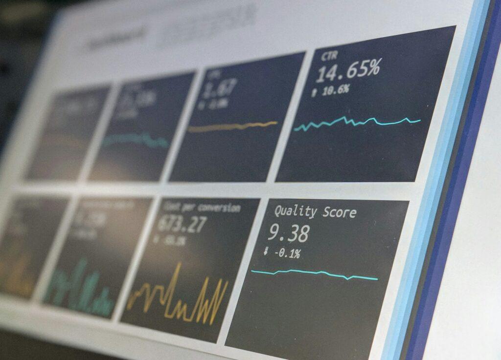
The numbers that decide what gets published cannot be compared as they sit: some run to the thousands, some to the units, and some are percentages. This is the mechanism I built to turn them into one ranked, human-actionable list: first, a logarithmic scale makes the magnitudes comparable; second, I score anticipated gain, what an update will win, via a positional click-rate matrix; the same logic carries over to conversion in a separate piece. The human keeps the final call.
The decision that programs the day
On a media operation the size of Melty, the question of what to publish and update, and in which order, is not a scheduling detail. It is the business. The site ran on roughly 6,000 dossiers, my French term for a celebrity or brand topic line, grouped into about 10 topics, with more than 50 new pieces produced every day.
That is the question behind this piece: how a repeatable decision gets made at scale, the systems question this site is built around. The obvious answer was off the table: the prior decision-support machinery had been lost in a deep site migration, and you cannot hand the ordering back to people deciding by feel; it does not scale past a few thousand pages and is inconsistent week to week. There was nothing left to reconstruct.
Under all of it sat a mechanical obstacle. The key performance indicators (KPIs) sit on scales that cannot be compared: values in the thousands, values in the units, and percentages. Until you solve that, you cannot add them up or say one page beats another.
Decide anticipated gain, not current score
I decided to build an aggregate scoring algorithm, and the decision rests on two choices. First, solve the scale problem with logarithms. Second, and this is the part most teams get wrong, score the gain you anticipate from acting, not the performance you currently report. I build decision tools for a living, the start of my about story.
The scale problem came first. My early attempts forced the KPIs together with multipliers, weighted by my experience, and it never really worked: the raw magnitudes kept fighting the weights. The unblocking idea came from a passing remark by an R&D director at a search tooling company, who said that putting values on a logarithmic scale made different magnitudes easy to compare. I tested it and everything came together: each KPI on a log scale, the important ones weighted, composed into one value.
The second choice mattered more. The client’s real question was never what performs best now. It was what percentage of clicks I would gain if I updated this article and not the other. Reporting tells you what already happened; anticipating gain tells you where to spend production effort next.
From incomparable numbers to a ranked list
The mechanism, in the order I built it.
The scale layer. Each KPI goes on a logarithmic scale so the thousands, the units, and the percentages land on a comparable band. I weight the important ones and compose them into one score per page or dossier; the weights are experience-tuned, not hard numerics, a point I return to.
The gain-anticipation layer. I built a per-topic click-rate matrix from the Google Search Console data, because click-through rate (CTR) differs by position and by topic. Applied to it is a positional rule I wrote and enforced: an optimized article gains about five positions from page 2, about three inside the top 10, and about one once already near the top, because the higher you go the harder it is to climb.
Apply the better click rate to the known weekly impression volume and you get an anticipated click gain per candidate. Rank by that gain, and the decision becomes a list the team can work down. For Melty, whose only objective was audience, this answered which update gains the most clicks.
Carrying over to conversion. The same gain logic carries over to a conversion objective; that two-sided composite gets its own piece.
Where it fought back
None of this was smooth; the friction points were concrete.
- The multiplier route failed for a long time before the log pivot; it was the honest dead end that made the fix count.
- The sheet grew unwieldy, dozens and dozens of columns, many there only to feed calculations, a few for the end KPI I wanted a decision-maker to see. Composite columns and hidden views cut the noise.
- The short-window dynamic data served reporting more than scoring, so I let it do that.
- The weights are tuned from experience, a limit of the method, not a virtue. I do not pretend otherwise.
The cost is the maintenance
- The beta tool. Static data exports in a Google Sheet, plus live data pulled through API calls that the CEO built himself. He was an engineer by training and chose not to mobilize his dev teams. At CréActifs, a static sheet, refreshed manually once a month, was enough at first.
The real price was the maintenance. The automation became worth it only when keeping the tool up by hand stopped scaling: three websites, then five, then 10. The rule of thumb is simple: automate when doing it manually costs more than the investment, projected over the months it saves. That is where the back-office automation, what became Edito Pilot, earned its cost.
The wider arc, the sale, the reuse across clients, the product that outlived the engagements, belongs to the editorial-priority algorithm; I am not retelling it here. This piece is about the mechanism.
What it leaves to the human
The tool was a decision helper, never an autonomous decider. At Melty the editor-in-chief kept the final call; at a lead-driven client the marketing lead did. The score cannot see production capability, the tension between objectives, or the easy versus the long shots. The human arbitrates, and that keeps the system honest rather than alarming.
Three boundaries are worth naming plainly.
- The system does not score every decision: there is no numeric threshold for when an old piece’s topic has drifted so far that you should stop reviving it and write a new one instead. That call is explicit human judgment, guided by a production-ratio rule, not by a number in the data.
- The weights are experience-tuned, not hard numerics, so every score carries the builder’s priors, mine.
- The gain it anticipates is only gain within the data it holds: brand-intent, new-market, or off-the-KPI signals are invisible to it.
That honesty is the point: a list whose boundary you cannot trust is a black box with a nicer coating. The mechanism worked, answered a real operational question at scale, and held up, because it stayed a decision helper with a human at the end.
If your operation runs a repeatable prioritization decision that still lives in people’s heads, or in a tool nobody can explain, let’s talk about applying the pattern.